DOCUMENTATION
DOCUMENTATION
Contents
- Editing Guide for the Website
- Online Ordering Process (coming soon)
- Email Notification Snapshots (UPDATED: Online Payment Links that lead to specific pages in the site, where the QR Code is found, is now there.)
Editing Guide for Website
This is a guide to help you find where to edit different information inside the website.
HOW TO LOG IN
- Please go to https://viamare.com.ph/wp-admin
- Use your email or username, and password to log in.
- You will now be led to the Admin Dashboard, where you will see the Main Menu on the left.
CHECKING WEBSITE ANALYTICS
- To check website analytics – web visits and more – at the Main Menu on the left, please look for the word Insights.
- From there, you will see lots of interesting statistics:
- Sessions: web visits
- Session Durations: how long they stayed in the site
- Bounce Rate: how many people leave after seeing the home page.
- New vs. Returning Visitors
- What device they are using to view the site.
- What country they are from.
- In what website did they hear about Via Mare.
- Most visited pages.
EDITING PAGES AND CONTENT
This part outlines the pages in the website, the image sizes in the website, and how to change text or images in both the desktop and mobile site.
Getting Started:
- Once logged into the site, please click to Pages in the Main Menu on the left.
- You will arrive at a list of all the pages in the website.
- Search for the page you want to edit, and click on Edit with Elementor.
- A Note On Desktop and Mobile Views: When you get to that page, you might notice that there are areas in the page that blurred and marked with diagonal stripes. This means that this part of the website is visible only in mobile phones. Although Elementor automatically creates websites that adjust well in mobile phones, there are still times that in order to make the website look good in both different views (desktop, tablets, mobile) , we have to create different versions of a single section. That’s why at times you see “double” of a title, “double” of a section, at some pages. Therefore, when changing text in these areas which are doubled, you have to do changes in both mobile and desktop versions every time you do a change. How to see the desktop version and mobile version of a website, while editting? Beside the green UPDATE button, there you see the following icons: an “eye”, a “computer screen”, a “timer” a “stack of squares”, and a “gear”. Please clicl on the “computer screen” icon, and then you will see three other icons, the “mobile phone” icon corresponding to mobile views, and the “tablet” icon for vertical tablet view. Please click on the mobile phone to see the mobile version.
- On Changing Text: All you need to do is to click on the text, and you will see on the left, where you can change the text. It works almost like Microsoft Word.
- On Changing Text Design: As mentioned, Elementor text works almost like Microsoft Word. When you click on a certain text, at the left you will see all the ways you can change the design of a text, under Content, Style, and Advanced. When you look into certain things, like i.e. Alignment, Line Height, Line Space , you will notice that it has a “desktop” icon beside it. This means you can make these designs so that the text Alignment, the Line Height, the Line Space, will look different in different devices: desktop view, tablet view, mobile view. It is important that the website looks good in all devices, so remember to look at things through mobile, tablet, or desktop views when you change designs.
- On Changing Images: In the same way that you change text, all you need to do is to click on the image and look at the left panel to see how you can change the image. Please click on Choose Image, and you will be led to a pop up window where you can choose a different image or upload a new one.
- On Changing Image Design: Under the Content area, you will see that you can change the image, change the image size, the alignment, and link (where you can change the image into a clickable link that will lead to another page, if you like to). Notice that you can change the image size in the Content area and the Style area. When you go to the Style area, notice that you can change the width, the max width, and the height of the image, and that you can make it look different in different devices (as you click on the “desktop” icon beside).
- On Changing Image Backgrounds: Please click in the light blue tab above the section of the website where you want to change the background. When you click on that, on the left tab, you should see the heading Edit Section. If you go to Style, and under style click on Background you will see where you can change the image. Again, notice that the background change has a “desktop” icon beside it, meaning you can have different backgrounds per different device.
- On Image Background Designs: You might see that there are different background options in the left panel:
- Background Type: You can have four different backgrounds based on what you like: (1) a block color or an image background, (2) a gradient background, (3) a video background, (4) and a slider background. For video backgrounds, you can use Youtube videos directly. For Slider Backgrounds, you can determine how fast the slides run.
- Position: Often, the images we place are bigger than the section allotted for them. How do you want to see your image? Where is the focal point of your image? You can play with the options to see how it works.
- Attachment: Do you want that scrolling effect where you scroll down and your image doesn’t move? You can do that here by choosing, Fixed.
- Repeat: This usually is for backgrounds that are “web tiles” instead of images. At each of the headers of the Via Mare site, we used web tiles to have a wavy effect on top of the background image. When you are using a web tile, please choose the option Repeat. Here are websites where you can find different web tile backgrounds:
- https://www.transparenttextures.com/
- https://www.toptal.com/designers/subtlepatterns/
- https://pngtree.com/free-patterns-background
- Size: There are different ways to size your background image. The most common thing used is Cover : meaning the image will be resized just enough to cover the whole background. As for Contain, image will be resized to fit inside the section. This is usually good for logo backgrounds. As for the other options, please feel free to test and try to figure it out.
Editing Spacing
There are different ways to edit spacing between elements in the website.
- Spacer. At the 9-square window icon at the left panel, on top, at the right of the Title, please click on it, and in the search bar, write Spacer. Once you see it, click on the spacer, hold down, and drag the spacer to the place where you’d like to put the space. Once done, you may adjust how many pixels of space you want.
- Padding or Margin. For every item, there is a way to adjust the padding and margin of an element. When you click on the element you want to adjust spacing on above/ below, and see its functions at the left panel, as mentioned earlier you will see three different sections: Content, Style, and Advanced. If you click on advanced, you will see Margin and Padding. You can add spacing on the right, left, top, bottom. What’s the difference between Margins and Paddings? Margins are spacing outside the item – meaning, for example, when you give a certain section that has the color red, a margin of 100px on top, a colorless space outside the section, between it and the item on top of it, will appear. But if you give the same red section a padding of 100px on top, a 100px space inside the section will appear, and that space is also red.
Image Sizes in the website:
- Large Banners / Backgrounds for all Pages : 1920 x 1280
- Home Page
- Image Sizes (in pixels) : “Always Perfect…” Section in Desktop (400 x 300) and in Mobile (400 x 400), Featured Menu 3 Photos (600 x 300 and 400 x 300)
- Online Menu Sizes : for Restaurant App and Cafe Menu Page:
- Menu Header Banner (desktop) : 810 x 240 px
- Menu Header Banner (mobile) : 540 x 285 px
- Menu Item Images : 335 x 225 px
- Section Headers : 600 x 178 px
- Order Accepted Image (desktop) : 810 x 430 px
- Order Accepted Image (mobile) : 540 x 860 px
CLEARING CACHE AFTER EDITING
It is important to always “clear cache” after editing so that you edits will be seen in the live site. How to clear cache: in the top menu item of the dashboard, please look for the diamond-like image with a lightning icon inside (image to follow) and hover on it. Under it, you will find the options : Manage, Settings, Image Optimization, Purge All… you can click on Purge All.
EDITING THE ONLINE MENU
For now, here is a video on how to edit the Online Menu
Online Ordering Process
Here is a short video of the online ordering process in its basic form:
Here are simple process charts for different processes:
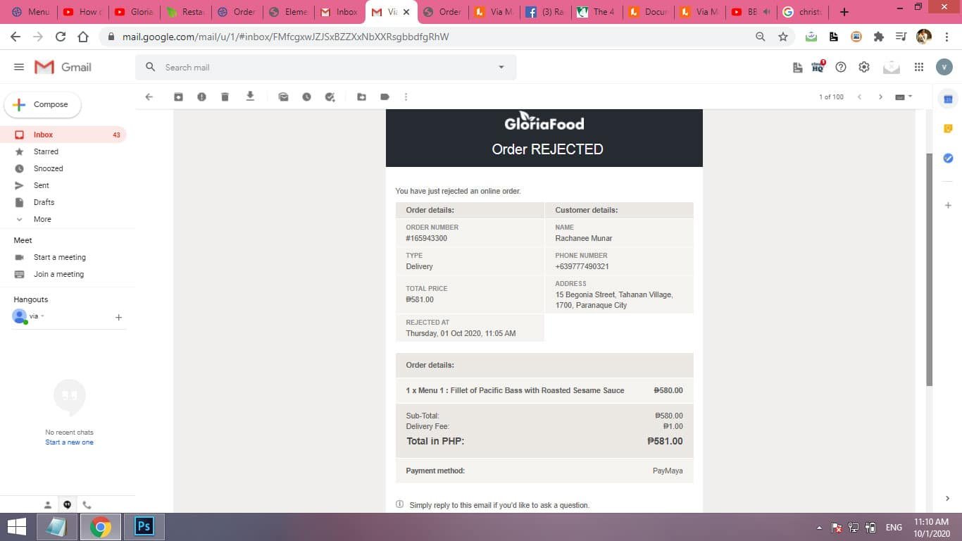
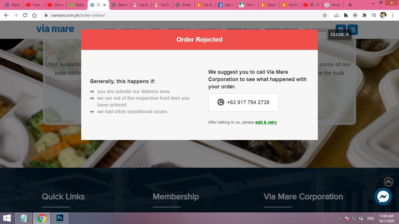
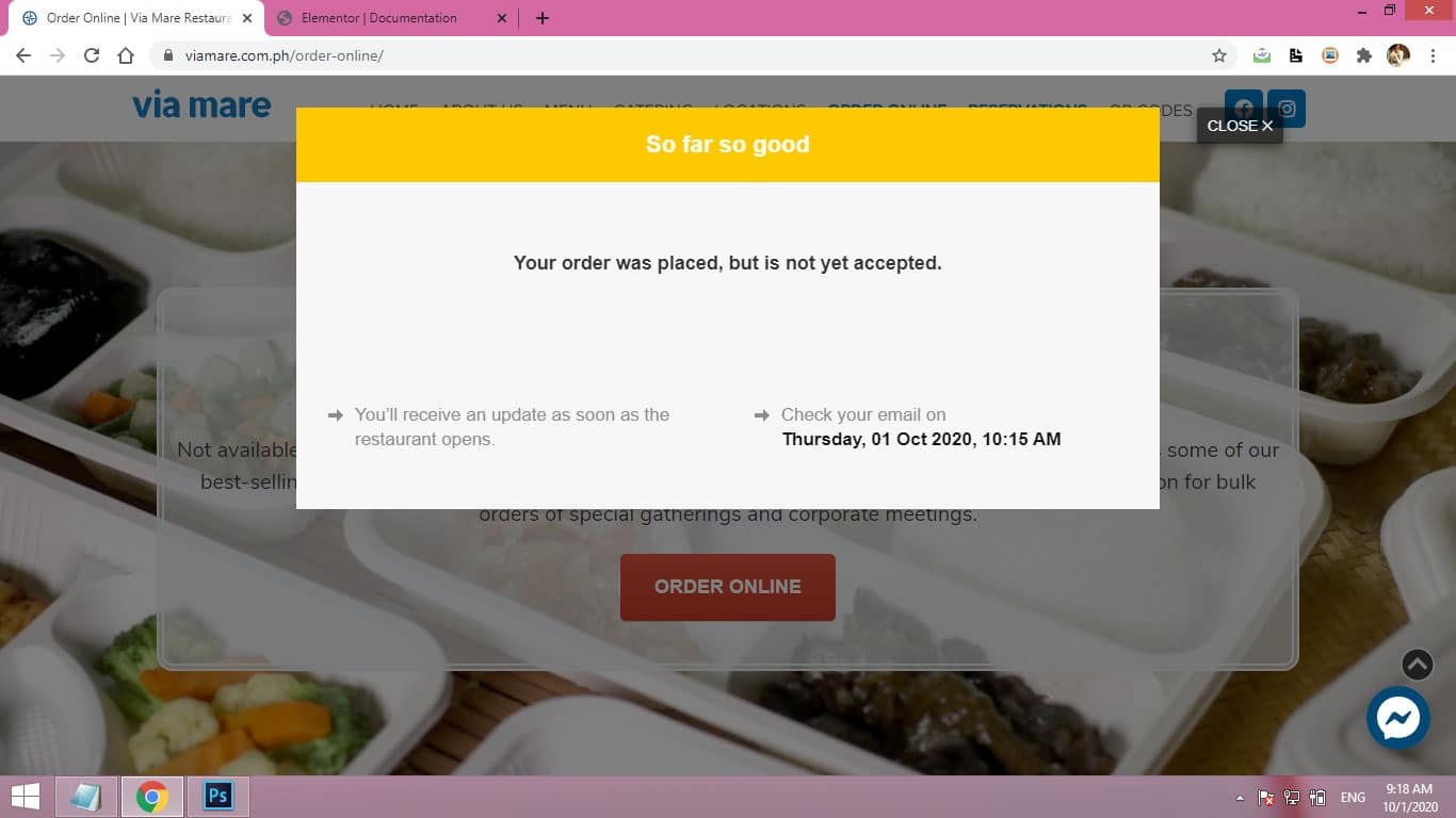
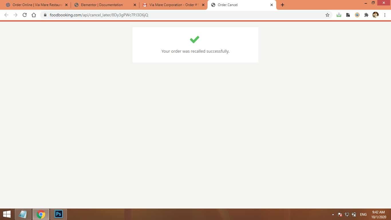
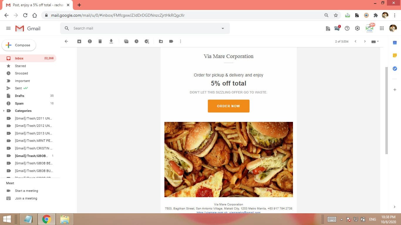
Here are the images for different emails and screenshots for the ordering process:
- All
- Screenshots
- Confirmed
- Missed
- Rejected
- Cancelled
- Promotion